Website:
https://daqua3103.wixsite.com/theevergreens
First edit:
- The front page will include an image of the singer of the band as the main focus and serves as the background for the entire website
- By using both a scroll and a tab format, it incorporates ideas from each of the websites I analysed as each has its own unique pros and cons
- The social media tabs at the top also feature in order to allow for cross-media convergence and to allow the audience to take an active roll in supporting the artist - allows for a relationship
- The 'About Us' section was included to introduce the band's values and ideas and, on the main page, it gives a brief introduction to this with a button linking to the 'About' page for more information.
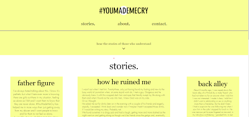
- This section was to introduce the main idea for the music video and to present the band's beliefs to their audience. It also allows for room to mention about the #YouMadeMeCry hashtag, a charity the band has to aid sexual assault survivors which links to a webpage where women can find solace in one another.
- The history section allows for personal stories from the artists to be shared, allowing them to feel closer with their audience and vice versa. The band have had experiences with sexual assault allows for them to be able to emphasise with their audience and makes them more 'human'.
- The concerts and events section is important for any artist as it is the only way they are able to share their tour dates apart from though social media and it allows them to link with the venues themselves, making booking easier for audiences
- I included events as well as concerts as the band hold free events in large parks to raise money and awareness for women in abusing situations and hardship.
- The music section would link to the band's Spotify and lists their newest album with all the new songs. It also lists the retail price and gives the audience the opportunity to share the album, creating this idea of an active audience.
- I am still debating whether or not to include the music video on the main home page simply because it is very low down and doesn't have as much of an impact and instead was thinking od including it on the 'Videos' page.
- I also may consider posting it on both to be extra sure that it is seen
- The photo album is used for the audience to gain an introspective view into the artists' lives with their performances, their promo shots and their friend lives.
- The contact section is mainly for the audience to message the band and to actually feel integrated and as though they have a relationship with the artists themselves.
- It also allows them to sign up to get updates on events, concerts and general news about the band

- The 'About' section is as continued from the main page and gives more information about the artist as well as background.
- The 'Videos' section is a place for me to put my music video as well as other videos I want to make
- I am thinking of making an interview of the whole band, as well as a Vogue-inspired interview, where I interview the artist in their home, as they give me a tour.
- I began creating the store for my website with merchandise with the album cover artwork I created. This is relative to the albums name, 'cry', as well as the artists specific brand identity with the hashtag #YouMadeMeCry and also the sexual assault aspect and the trauma behind it.
- This section is simply to present to the audience the clothes they've bought and have added to their cart.
- As well as this, the website allows you to log in to your profile which may be able to give you special access to the website


