I made a video of small sketches for the shots I wish to use in my music video. This is a base idea and may decide to change it due to circumstances on the day of filming, for example. It's a very basic idea surrounding what I wish to do.
(Please excuse the drawings, I am NOT an art student!)
Tuesday, 2 June 2020

Generic Research: Textual Analysis 3 (Website)
Big Thief is a small Indie band who are only recently starting to gain attention, despite having been active since 2016. Both their latest albums U.F.O.F and Two Hands received high reviews from critics and both got into the Top 10 in the US Indie charts.
Big Thief uses their branding to create a simplistic almost homemade aesthetic. Having been known to play in pubs and small venues around the globe, the band are low-key indie pop artists who have a neutral stylised genre in music, which is reflected through their website
 - The website opens to an image of the band which allows for gratification for fans, is also recognisable for those who have seen the album and have come to the website from that
- The page introduces the band and their latest album Two Hands as well as mentioning it at the bottom and linking it with the Buy/Stream button. This allows audiences to engage with the website easily.
 - The menu button at the side allows the audience to easily guide themselves through the website and gives ease of access with single page slides that some websites don't have (in favour of scrolling)
 - The videos section of the website allows the audience to watch some of the music videos produced by the band and this allows audiences to easily access the information
 - Here are written the tour dates which are easily spread out and each individual event links to the area where they are performing and place to buy the tickets, allowing for easily accessible content
 - The music section links to the bands latest albums and the Spotify playlist of them are links so when you click it, it takes you to their app so that you can play the music for yourself.
- As well as this, on the front page, there is a small list of social media and included are Apple Music and Soundcloud, meaning that there is a wide range of platforms available for listening to their songs.
- It also is in keeping with the colour palette of the rest of the website, creating a strong sense of brand identity
 - As well as being able to personally contact them, Big Thief have a section for business contacting, which are used for press releases, booking and management. Because they are a fairly small band, this section is important for them as it allows for people to get in touch if they are scouted and can make more money from being booked for special occasions, etc.
 - Just like the artists I've looked at, Big Thief also has a way for their fans to get in contact and to hear more about their recent releases, album updates and personal stories to form more of a relationship with the band.
 - From the store section, you are taken to another page where their clothing brand is advertised with different styles relating to their music.
- As well as this, the band also sells their music in CD, vinyl and cassette, the latter being very rare now as the demand for physical copies of music has decreased. This suggests that their target audience is likely to listen with old fashioned devices, maybe being more alternative.
 - As mentioned before, the band includes multiple ways of listening to their music, allowing for a wider audience to engage

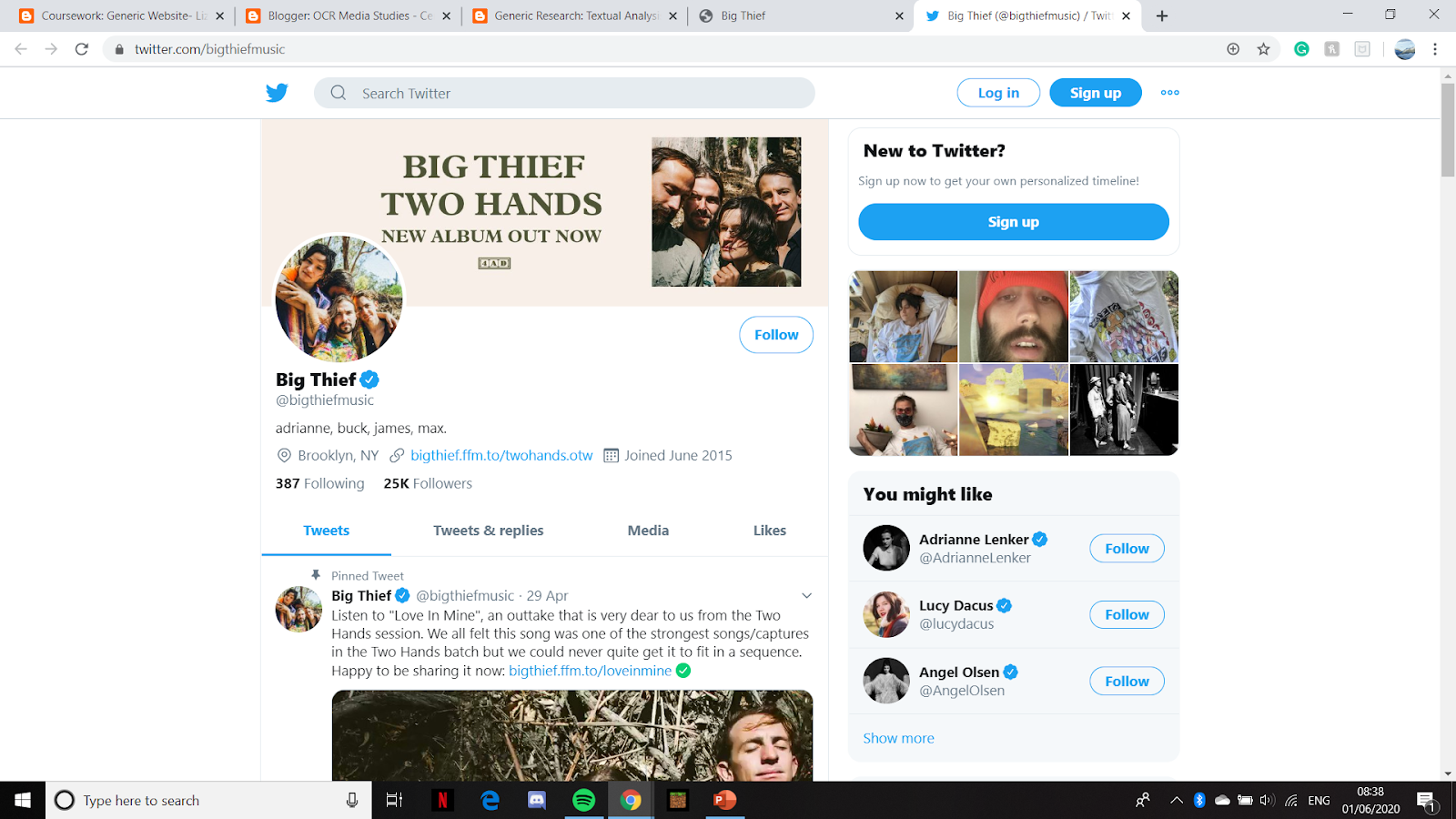
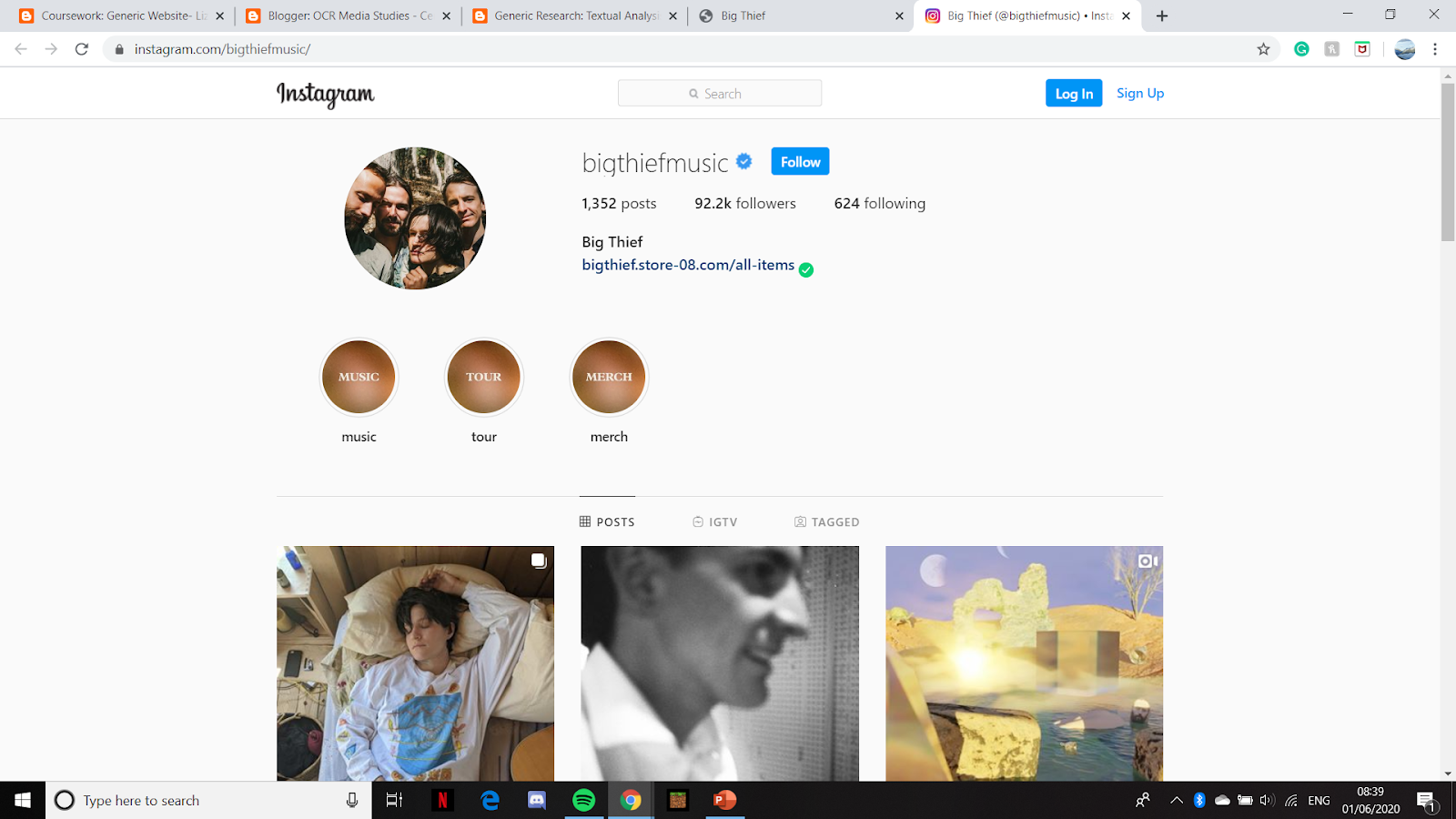
 - They aren't very active on their band social media, using it mainly to introduce their music and merchandise. There are each individually active on their own personal social media platform, suggesting that their idea of the brand is more business orientated.

Big Thief uses their branding to create a simplistic almost homemade aesthetic. Having been known to play in pubs and small venues around the globe, the band are low-key indie pop artists who have a neutral stylised genre in music, which is reflected through their website

- The page introduces the band and their latest album Two Hands as well as mentioning it at the bottom and linking it with the Buy/Stream button. This allows audiences to engage with the website easily.


- As well as this, on the front page, there is a small list of social media and included are Apple Music and Soundcloud, meaning that there is a wide range of platforms available for listening to their songs.
- It also is in keeping with the colour palette of the rest of the website, creating a strong sense of brand identity


- As well as this, the band also sells their music in CD, vinyl and cassette, the latter being very rare now as the demand for physical copies of music has decreased. This suggests that their target audience is likely to listen with old fashioned devices, maybe being more alternative.


- The idea of brand identity is created through the use of the brand image across all social media (which means they are automatically utilising cross-media convergence) and lets the audience know that they're on the right account.
Sunday, 31 May 2020
Generic Research: Textual Analysis 2 (Website)
As mentioned before when analysing MILCK's music video Quiet, she is an advocate for Women's Rights and her claim to fame came from the 2017 Women's March where a video of her and friends singing an acapella song of quiet went viral. Her website reflects the values she has and shows her using her platform to bring awareness to sexual assault as with the hashtag #ICan'tKeepQuiet.
 - As soon as you enter the site, you are met with a prompt to join the Gentle Rebel, an intertextual reference to the book, presents the idea of protesting without hurting anybody
- The way that this is advertised makes it seem like a very personal relationship with the artist is what the audience is looking for with the fact that you receive handwritten emails from MILCK herself allow the audience to build this interpersonal relationship with her.


 - The static in the cube for this song creates a sense of uncertainty and trying to block out everything in favour of calm and serenity. Although she sings about being strong, she is still uncertain as to where this may lead her.


 - The rising water in this cube symbolises the fact that, due to her breakup, she feels like she is growing, surrounded by this rising water and is unsure how to get out

 - At the bottom of the page, there is a section for tour date which, obviously due to COVID-19, is empty, despite her having released an EP this year
- There is also another part advertising the email updates and this is again trying to encourage the audience to take part actively
 - When you click on the Get It Now button beneath the album cover, it takes you to another tab where you can choose which program you wish to listen to the music on. This allows for a wider audience and for people who may not be able to access Apple Music due to the paywall, can access it for free on YouTube.
 - The shop is generally pretty conventional with both music and clothing for sale branded with MILCK's aesthetic such as the gold and black as well as her hashtag #ICan'tKeepQuiet
 - Something a little more unconventional however is the fact that, with pre-ordered items, you receive a personal note from the artist. This personal touch allows the audience to feel more connected with MILCK and creates a relationship between artist and consumer.
- This idea is also only likely possible because she has a smaller fanbase than some other, bigger singers. Because of this, she can afford to send personal messages to people and doesn't take much out of her time
 - An idea of brand identity is created through the use of the banner across all social media (which are automatically utilising cross-media convergence) and let the audience know that they're on the right account.
 - MILCK's Twitter is obviously up-to-date as she posts about the George Floyd situation as well as the rioting taking place in America at the moment.
- Is an active member of social media which lets her audience engage with her more, strengthening a personal relationship
 - Her Instagram has also been updated recently with self-care for activists and she is, therefore, targeting her audience who are likely to be culturally aware young people, likely to take parts in movements like this

Textual Analysis of MILCK's Website from daisyq2
As a small brand in of itself, MILCK uses her website in order to engage the audience by using certain aesthetics and interesting techniques to engage her audience and make them feel a part of both her music and her values.
As a small brand in of itself, MILCK uses her website in order to engage the audience by using certain aesthetics and interesting techniques to engage her audience and make them feel a part of both her music and her values.

- The way that this is advertised makes it seem like a very personal relationship with the artist is what the audience is looking for with the fact that you receive handwritten emails from MILCK herself allow the audience to build this interpersonal relationship with her.

- When you click on each individual album/EP that MILCK has on her website you are greeted with one of the videos from it along with an explanation as for her inspiration and reasons behind making it, allows audiences a closer look into their idols life and this makes the singer feel a lot more human, knowing that she struggles with love and family just like anyone else.
- As well as this, when you read more about each album, the cube at the top of the screen changes, depending on which album you're viewing, an interesting Easter Egg which creates an aesthetic.
- This cube grows flowers suggesting that MILCK as a person is growing and blooming and finally becoming her true beautiful self.
- When looked at from bottom to top, the cubes tell a story of heartbreak circling back round to finally being able to heal, which is anchored by MILCK's explanations for her songs.


- There is also another part advertising the email updates and this is again trying to encourage the audience to take part actively


- This idea is also only likely possible because she has a smaller fanbase than some other, bigger singers. Because of this, she can afford to send personal messages to people and doesn't take much out of her time


- Is an active member of social media which lets her audience engage with her more, strengthening a personal relationship


- As previously mentioned, MILCK set up a hashtag #ICan'tKeepQuiet which is a movement against rape and sexual assault, where women can join and share stories and help one another in the journey of recovery and self-healing.
- The website's colours are light and calm, creating a gentle atmosphere and the use of pink genders the site as it is targetted towards women.
- The website's colours are light and calm, creating a gentle atmosphere and the use of pink genders the site as it is targetted towards women.
Generic Research: Textual Analysis 1 (Website)
Florence and the Machine is a band that plays mainly indie pop and has been active since 2008. The singer, Florence Walsh is an eclectic artist that is known for her hippie attitude to music where she chooses to express herself.
Her website reflects this side of herself by not being the conventional website. Instead of giving information about the author, Florence chooses to instead have an artistic promo for her new album with small, hand-drawn illustrations with aged photographs of herself. They reflect a certain aesthetic she has and makes her more appealing to those who enjoy a simplified website.
Florence and the Machine have a website that is written for a supportive audience to engage. It introduces the audience to both new and fresh releases. The website is both pandering to the fans with the introduction of known music as well as introducing a 'best of' to people who are visiting for the first time.

 - The embedded video spins around and introduced the album cover and introduced the audience to her 10th Anniversary Edition of her album, long-term fans of hers understand the reference to her old album and will be interested to see if there are any differences on the special edition
- This home page also suggests that it changes periodically, depending on the events Florence is having at the time, as the 10th Anniversary section cannot be used permanently.
- There is no clear masthead although Florence's logo is shown at the side of the page with her social medias underneath (although they're not visible in the screenshot)
- Depending on which button the audience presses, they are taken to different pages such as with her store and to listen to her music
- There is no navigation bar and, instead relies on the audience scrolling down the page to look at the homemade effect of the website
 - When you click on the individual social media platforms that Florence has on her webpage, you have this cross-media convergence which allows the audience to have a more interpersonal relationship with her as they can follow and interact with her media accounts.
- There is an idea of the brand image shown through the repeated image used in her social media, making her easily recognisable and familiar.
- Her Facebook is her least active account where, the majority of the time, she posts thanking her audience and reposting things from her other accounts, this is due to the fact that her target audience is millennials who are more likely to use Instagram or Twitter, of which Florence is more active on.
 - Florence uses her Twitter to post new music but also to retweet images, videos and messages that her fans leave for her, creating this idea of the interpersonal relationship between fans and celebrities
 - Instagram is known for being a photograph page which allows users to share images with captions. Her personal page of @florence is used to share short stories and poems she finds interesting and images and paintings she likes
- This juxtaposes her band account that consists of promos for new songs and videos at concerts and represents the differences between a personal account and a business account
 - A YouTube account is important for artists as it correlates all their music and music videos into one area and gives ease of access to their fans and people who want to view their videos
- As well as this, YouTube is the most popular video streaming site on the internet and therefore, by using that site, they're likely to get more views than if they were to use Vevo or another music video streaming site.
 - Florence and the Machine also have a Spotify account which helps promote the music. Unlike Apple Music, Spotify is free and has over 240,000,000 users of both free and premium which allows for a much wider audience to listen to her music, a plus for the band as they can reach more people
- However, Spotify doesn't share music videos which is why both YouTube and Spotify are utilised in order to share their music on a wider scale
 - If you choose to sign up to the website, a pop-up shows which allows you to sign up for the newsletter in order to get more information about your favourite artist.
- The pop-up also mentions about getting more information from Universal Studios about other artists similar to Florence and the Machine, an example of self-promotion and trying to get a wider audience not only for Florence but for other bands under the same studio in order to try and get more money.


 - Both buttons Out Now and Listen Now take the viewer to separate tabs of which you can choose where to listen to her music.
- Simple and easy to manoeuvre and understand
 - Her website includes another embedded video of the best highlights in concert of her Lungs tour, with the age shown by the audience and the phones they hold
- It is her celebrating her achievement of having come this far
- The link takes you to the same site as above and allows the audience to listen to her album
 - On the home page, there is an option to click Live Dates which takes you down the page to this section. The entire webpage is also accessible to scroll on it, making it easily accessible to anyone.
- This part of the website would usually have the times and dates of Florence and the Machine's next performances, however, due to COVID-19 and also the fact of no recent album releases, there are no dates on her website.
- The band is known for also playing at festivals and this would be advertised on the festival's webpage as well, therefore appealing to a wider audience who may find interest in Florence
 - As you continue scrolling down the page you get to Florence's most recent release, High As Hope which is advertised here with links to buy it and listen to it. This reminds audiences that she has new music as well and the whole theme of the website is based on this album with the lighter colour palette and illustrative detailing.


Her website reflects this side of herself by not being the conventional website. Instead of giving information about the author, Florence chooses to instead have an artistic promo for her new album with small, hand-drawn illustrations with aged photographs of herself. They reflect a certain aesthetic she has and makes her more appealing to those who enjoy a simplified website.
Florence and the Machine have a website that is written for a supportive audience to engage. It introduces the audience to both new and fresh releases. The website is both pandering to the fans with the introduction of known music as well as introducing a 'best of' to people who are visiting for the first time.

- First takes the user to the main page of which is unconventional and doesn't have a taskbar or any buttons
- An embedded video fades in with a red square with 'Lungs' written across it in the iconic font used the majority of the time for Florence and the Machine's music
- The simplicity is something introduced early on and is repeated throughout the entirety of the website

- This home page also suggests that it changes periodically, depending on the events Florence is having at the time, as the 10th Anniversary section cannot be used permanently.
- There is no clear masthead although Florence's logo is shown at the side of the page with her social medias underneath (although they're not visible in the screenshot)
- Depending on which button the audience presses, they are taken to different pages such as with her store and to listen to her music
- There is no navigation bar and, instead relies on the audience scrolling down the page to look at the homemade effect of the website

- There is an idea of the brand image shown through the repeated image used in her social media, making her easily recognisable and familiar.
- Her Facebook is her least active account where, the majority of the time, she posts thanking her audience and reposting things from her other accounts, this is due to the fact that her target audience is millennials who are more likely to use Instagram or Twitter, of which Florence is more active on.


- This juxtaposes her band account that consists of promos for new songs and videos at concerts and represents the differences between a personal account and a business account

- As well as this, YouTube is the most popular video streaming site on the internet and therefore, by using that site, they're likely to get more views than if they were to use Vevo or another music video streaming site.

- However, Spotify doesn't share music videos which is why both YouTube and Spotify are utilised in order to share their music on a wider scale

- The pop-up also mentions about getting more information from Universal Studios about other artists similar to Florence and the Machine, an example of self-promotion and trying to get a wider audience not only for Florence but for other bands under the same studio in order to try and get more money.

- When you click on Store, you are taken to another tab with the iconic font for her album Lungs. The colour scheme of red and gold reflects that of the album cover and the new vinyl aesthetic that has been used to update the newest release of the album.
- The site has the main page which gives a range of choices to buy from, especially marketing the seasonal 10 year anniversary rerelease
- Colour scheme is consistent throughout the whole site and compliments that of the main website

- It is also split up into sub-sections with Music and Merchandise being separated, creating ease of movement through the pages
- The music section has both her new and old music in ascending order with the oldest at the bottom and the most recent at the top. It allows audiences to decipher what sort of album they want.
- The merchandise has a mixture of both her old and new clothing which gives the audience a choice of what style they wish to have. The hand-drawn artwork on some of the shirts reflects the style of the main website as you scroll down, furthering this brand identity
- She also sells a book of lyrics and poetry Florence herself has written which is a very personal perchance allowing the audience to feel as though they have a personal relationship with her. It's an unconventional item to have in a merchandise store and this and the name of the book - Useless Magic - reflects the style and aesthetic Florence wishes to achieve.


- Simple and easy to manoeuvre and understand

- It is her celebrating her achievement of having come this far
- The link takes you to the same site as above and allows the audience to listen to her album

- This part of the website would usually have the times and dates of Florence and the Machine's next performances, however, due to COVID-19 and also the fact of no recent album releases, there are no dates on her website.
- The band is known for also playing at festivals and this would be advertised on the festival's webpage as well, therefore appealing to a wider audience who may find interest in Florence


Friday, 29 May 2020
Generic Research: Textual Analysis 5 (Music Video)
Connie Lim, known by her stage name MILCK, is a small singer based in LA. She initially rose to fame after a video of her performing her song 'Quiet' at the 2017 Women's March went viral. The acapella number was praised and embraced as an anthem for the movement as it speaks out against sexual abuse and highlights how the victims will share their stories in an attempt to help save lives. She's an activist for women's rights and sexual assault survivors as she herself is one, having written the song 'Quiet' as a way of coping with abuse. She was eventually signed to Atlantic Records and released her debut EP This Is Not The End in 2018.
The music video for Quiet features a very powerful performance scene where women are all standing in a room playing instruments and singing with MILCK herself and I want to create a similar sense of unity in my own music video. It creates a sense of empowerment and, although the song is quite emotional, the joy the women seem to have at the end of the video suggests that there is happiness even in dark times.
The music video for Quiet features a very powerful performance scene where women are all standing in a room playing instruments and singing with MILCK herself and I want to create a similar sense of unity in my own music video. It creates a sense of empowerment and, although the song is quite emotional, the joy the women seem to have at the end of the video suggests that there is happiness even in dark times.
This music video ending is incredibly powerful and makes you feel strong, despite the audience not being present in the video. I wish to create a similar atmosphere with my music video.
Generic Research: Textual Analysis 4 (Music Video)
I decided to do another two Textual Analysis in order to study a couple of music videos about sexual assault as well. However, I decided to still use a long continuous shot for some scenes and therefore Textual Analysis 1 still refers to my revised pitch.
Lady Gaga is a long time activist for LGBT right, women rights and has repeatedly supported the Black Lives Matter movement along with multiple others throughout her career as an artist. Her activism has brought her a lot of attention as well as outlandish fashion sense and tendency to cause controversy. Although her usual style of music is considered to be pop dance electronic, Gaga shows her vocals in the sombre song Til It Happens To You which speaks out against sexual assault. In her music video, she attempts to highlight the sexual assault that happens on campus to girls, from friends and strangers. It's a powerful song that juxtaposes the rest of her other more upbeat music and is emotional with the message of overcoming abusers and standing tall.
I wanted to take influence from this video from the way that there are almost two sections of the music video: the first half being the vulnerable women who are attacked but the second half shows them conquering this and becoming powerful as they stand with one another. I want this set-up to be used in my own video with the first half being with the singer oppressing the victim and have the woman overcoming their strength in the second half.
https://www.youtube.com/watch?v=ZmWBrN7QV6Y
The music video for Til It Happens To You was created as a visual art piece to bring awareness to sexual assault of young women on campus and the video itself has a very high budget feel. The see of professional cameras suggest at the severity of the topic and the video has a high quality to it, creating a moving and emotional piece. The whole video has a black and white filter, furthering this emotional value to it and suggestive of the deep and meaningful story behind it. There is no performance in the video, instead, giving way to the narrative.
Lady Gaga is a long time activist for LGBT right, women rights and has repeatedly supported the Black Lives Matter movement along with multiple others throughout her career as an artist. Her activism has brought her a lot of attention as well as outlandish fashion sense and tendency to cause controversy. Although her usual style of music is considered to be pop dance electronic, Gaga shows her vocals in the sombre song Til It Happens To You which speaks out against sexual assault. In her music video, she attempts to highlight the sexual assault that happens on campus to girls, from friends and strangers. It's a powerful song that juxtaposes the rest of her other more upbeat music and is emotional with the message of overcoming abusers and standing tall.
I wanted to take influence from this video from the way that there are almost two sections of the music video: the first half being the vulnerable women who are attacked but the second half shows them conquering this and becoming powerful as they stand with one another. I want this set-up to be used in my own video with the first half being with the singer oppressing the victim and have the woman overcoming their strength in the second half.
https://www.youtube.com/watch?v=ZmWBrN7QV6Y
The music video for Til It Happens To You was created as a visual art piece to bring awareness to sexual assault of young women on campus and the video itself has a very high budget feel. The see of professional cameras suggest at the severity of the topic and the video has a high quality to it, creating a moving and emotional piece. The whole video has a black and white filter, furthering this emotional value to it and suggestive of the deep and meaningful story behind it. There is no performance in the video, instead, giving way to the narrative.
Saturday, 9 May 2020
Planning: Reflection on Moderator's Report
Brief 4: You work for an independent media production company. You have been given the task of producing a three-minute music video for a protest song* by a fictional band/artist signed to Warner Music Group, and two pages for the working website for the band/artist for a socially-conscious, 16–25, middle to upmarket demographic.
Important things to consider when doing coursework from the moderator's report from last years NEA
1. Make sure that your editing fits the track or else the video won't be as cohesive as you necessarily want it to be.
2. Don't film the actors from behind (unless necessary) as doesn't suggest at a range of shots and also doesn't adhere to Andrew Goodwin's.
3. Avoid using vertical mobile phone shots.
4. Use an element of performance as those were the ones that achieved higher marks.
5. Use Wix to complete your website as it is easy to use, isn' complicated and is free.
6. Use the same models in your music video to on your website to show this idea of cross-media convergence.
7. The best music videos demonstrated technical skills and understanding of codes and conventions of music videos.
8. The statement of intent needs to be equally balanced between the music video and the website so it can summarise both parts of the coursework.
9. Use costume to create this idea of representation.
10. An online blog and record of your studies is better than a hard copy which can get damaged or lost.
Important things to consider when doing coursework from the moderator's report from last years NEA
1. Make sure that your editing fits the track or else the video won't be as cohesive as you necessarily want it to be.
2. Don't film the actors from behind (unless necessary) as doesn't suggest at a range of shots and also doesn't adhere to Andrew Goodwin's.
3. Avoid using vertical mobile phone shots.
4. Use an element of performance as those were the ones that achieved higher marks.
5. Use Wix to complete your website as it is easy to use, isn' complicated and is free.
6. Use the same models in your music video to on your website to show this idea of cross-media convergence.
7. The best music videos demonstrated technical skills and understanding of codes and conventions of music videos.
8. The statement of intent needs to be equally balanced between the music video and the website so it can summarise both parts of the coursework.
9. Use costume to create this idea of representation.
10. An online blog and record of your studies is better than a hard copy which can get damaged or lost.
Subscribe to:
Posts (Atom)
-
 In order to allow audiences to interact more, and for them to receive gratification from it, I included a link to my second website in order...
 -
My music video was meant to represent the problems that victims of sexual assault face and the journey they take to reclaim their power afte...
-
I made a video of small sketches for the shots I wish to use in my music video. This is a base idea and may decide to change it due to circu...